I’m not a designer, but I’ve learned a few tricks over the years. The first thing you need to understand is there is a relationship between the content and the design. You need to learn to see patterns and needs in the content. Your reader, or audience, will respond to the hierarchy, organization, contrast and white space you create.
Your design will create entry points and flow allowing readers to jump in and out of the content. You’ve got to create a balance. Simplicity is usually best. And if it’s something your reader will see again and again, you need to create consistency.
Start with your information and the basics of the pages you are working with. What size will the piece be? How much content will you fit? What graphics and photos are available? I suggest you do a few rough thumbnail sketches and start trying to organize the information in a way that makes sense.
Determine the most important information and give it prominence. How can you draw attention to the information? How can you create the response you are wanting?
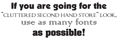
Keep in mind that fonts are part of your design too. Use the same font family if possible. The different faces of the font can give your piece uniformity while allowing you freedom to add interest. Multiple fonts end up looking junky and out of place. Vary the size and boldness to add interest.
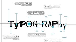
Typography is an interesting design element. There are several classes of type: old-style, modern, slab serif, san serif, script and decorative. Each has a use and place in today’s design.
Old-style: It’s familiar and safe. It will give your piece a professional look. It won’t draw attention. It’s good for all mediums. If you are writing for an elderly population, these fonts are easy on the eyes. It includes font families such as Goudy, Palatino and Times.
Modern: It’s striking and contemporary. It’s class. Some say it’s cold. It’s not good for body copy. It includes Times Bold, Fenice and Nofret. It has extreme thick and thin lines. 
Slab Serif: It’s readable and has graphic appeal. Used a lot in advertising. Great for headlines and small blocks of text. It includes New Century Schoolbook, Journal and Lucida.
Sans Serif: It’s legible and clean. Simple. Considered contemporary. It’s great for web design, especially body copy because it’s easier to read on a screen. It includes Arial, Helvetica and Syntax.
Script: It gives the appearance of hand lettering. Includes Brush Script and Calligraphy.
Decorative: Graphic and distinctive. Not for blocks of copy. It includes Alley Cat and Juniper.
Your text alignment is important too. Flush left justified is easier to read. Centered text is hard to read because it lacks a starting point. Alignment creates visual interest and organizes thoughts. Your text should be a unifying force in your design. Use flush right for numbers.
Repetition is a great element to incorporate as well. Repeating a visual element unifies and strengthens a design. It also adds visual interest.
You’ve got to create a focal point. This is simply something that attracts attention. You can achieve this through the placement of an element, increasing or decreasing the size, adding color, or isolating an item on the page. Each page needs one main focal point – not several. It’s there to intentionally grab a reader’s eye and it needs to be something worth looking at.
White space adds a rest spot to your design. It doesn’t need to be uniform. It’s a great organization tool in design and aids in the flow of the reader’s eye.
Most Read, Shared, and Saved Blog Posts of 2025
These are the blog posts you read, shared, saved, and came back to in 2025—some newer, some timeless favorites that continue to strike a chord years later.


